
This is the sixth of a new series of posts on ASP .NET Core 3.1 for 2020. In this series, we’ll cover 26 topics over a span of 26 weeks from January through June 2020, titled ASP .NET Core A-Z! To differentiate from the 2019 series, the 2020 series will mostly focus on a growing single codebase (NetLearner!) instead of new unrelated code snippets week.
Previous post:
NetLearner on GitHub:
- Repository: https://github.com/shahedc/NetLearnerApp
- v0.6-alpha release: https://github.com/shahedc/NetLearnerApp/releases/tag/v0.6-alpha
In this Article:
- F is for Forms (and Fields)
- Tag Helpers for HTML form elements
- NetLearner Examples
- Razor Pages with BindProperty
- Blazor Example
- References
F is for Forms (and Fields)
Before Tag Helpers were available, you would have to use HTML Helper methods to create forms and their elements in a ASP .NET Core views. This meant that your form could look something like this:
@using (Html.BeginForm())
{
   <input />
}
With the introduction of Tag Helpers, you can now make your web pages much more cleaner. In fact, Tag Helpers work with both MVC Views and Razor Pages. The syntax is much simpler:
<form method="post">
This looks like HTML because it is HTML. You can add additional server-side attributes within the <form> tag for additional features.
<form asp-controller="ControllerName" asp-action="ActionMethod" method="post">
In this above example, you can see how the attributes asp-controller and asp-action can be used to specify a specific controller name and action method. When these optional attributes are omitted, the current controller and default action method will be used.
Optionally, you can also use a named route, e.g.
<form asp-route="NamedRoute" method="post">
The asp-route attribute will look for a specific route with the name specified. When the form is submitted via HTTP POST, the action method will then attempt to read the form values via a passed values or bound properties.
In a Controller’s class file within an MVC app, you can set an optional Name for your action method’s Route attribute, as shown below:
[Route("/ControllerName/ActionMethod", Name = "NamedRoute")]
public IActionResult ActionMethod()
{
}
While you won’t find new Tag Helper equivalents for each and every HTML Helper you may have used in the past, you should consider using a Tag Helper wherever possible. You can even create your own custom Tag Helpers as well. For more information on custom Tag Helpers, check out the official documentation:
- Author Tag Helpers: https://docs.microsoft.com/en-us/aspnet/core/mvc/views/tag-helpers/authoring
Tag Helpers for HTML form elements
Below is a list of Tag Helpers with their corresponding HTML form elements:
Input Tag Helper
Let’s say you have a model with a couple of fields:
public class MyModel
{
   public string MyProperty1 { get; set; }
   public string MyProperty2 { get; set; }
}
You can use the following syntax to use an Input Tag Helper with an expression name assigned to the asp-for attribute. This allows you to refer to the properties without requiring the “Model.” prefix in your Views and Pages.
@model MyModel
...
<!-- Syntax -->
<input asp-for="<Expression Name>" />
...
<!-- Examples -->
<input asp-for="MyProperty1" />
<input asp-for="MyProperty2" />
Corresponding to the Input Tag Helper, there are existing HTML Helpers, with some differences:
- Html.TextBox: doesn’t automatically set the type attribute
- Html.TextBoxFor: also doesn’t automatically set the type attribute; strongly typed
- Html.Editor: suitable for collections, complex objects and templates (while Input Tag Helper is not).
- Html.EditorFor: also suitable for collections, complex objects and templates; strongly typed
Since Input Tag Helpers use an inline variable or expression in your .cshtml files, you can assign the value using the @ syntax as shown below:
@{
   var myValue = "Some Value";
 }
 <input asp-for="@myValue" />
This will generate the following textbox input field:
<input type="text" id="myValue" name="myValue" value="Some Value" />
To create more specific fields for email addresses, passwords, etc, you may use data-type attributes on your models to auto-generate the necessary fields. These may include one of the following enum values:
- CreditCard
- Currency
- Custom
- Date
- DateTime
- Duration
- EmailAddress
- Html
- ImageUrl
- MultilineText
- Password
- PhoneNumber
- PostalCode
- Text
- Time
- Upload
- Url
// For example:
[DataType(DataType.Date)]
public DateTime DateOfBirth { get; set; }
Note that each attribute can be applied on a field for the view/page generator to infer the data type, but is not used for data validation. For validation, you should use the appropriate validation techniques in your code. We will cover validation in a future blog post, but you can refer to the official docs for now:
- Model validation in ASP.NET Core MVC: https://docs.microsoft.com/en-us/aspnet/core/mvc/models/validation
- Add validation to an ASP.NET Core Razor Page: https://docs.microsoft.com/en-us/aspnet/core/tutorials/razor-pages/validation
Checkboxes
Any boolean field in your model will automatically be turned into a checkbox in the HTML form. There is no extra work necessary to specify that the input type is a “checkbox”. In fact, the generated HTML includes the “checkbox” type automatically, sets the “checked” property if checked and wraps it in a label with the appropriate caption. For example, imagine a boolean field named “IsActive”:
// boolean field in a model class
public bool IsActive { get; set; }
<!-- input field in page/view wrapped in label -->
<label class="form-check-label">
   <input class="form-check-input" asp-for="IsActive" />
   @Html.DisplayNameFor(model => model.IsActive)
</label>
<!-- HTML generated for boolean field -->
<label class="form-check-label">
<input
   class="form-check-input"
   type="checkbox"
   checked="checked"
   data-val="true"
   data-val-required="The IsActive field is required."
   id="IsActive"
   name="IsActive"
   value="true"> IsActive
</label>
Hidden Fields
In case you’re wondering how you can generate a hidden <input> field, you can simply use the [HiddenInput] attribute on your hidden field’s property, as shown below. If you wish, you can explicitly set “type=hidden” in your Page/View, but I prefer to set the attribute in the model itself.
// hidden property in model class
[HiddenInput]
public string SomeHiddenField { get; set; } = "Some Value";
<!-- hidden field in page/view -->
<input asp-for="SomeHiddenField" />
<!-- HTML generated for hidden field -->
<input type="hidden" id="SomeHiddenField" name="SomeHiddenField" value="Some Value">
Radio Buttons
For radio buttons, you can create one <input> tag for each radio button option, with a reference to a common field, and a unique value for each radio button. Each input element can be paired with a label to include a proper (clickable) text caption . You can generate these in a loop or from a collection from dynamically generated radio buttons. To avoid reusing the same id for each radio button, you could use a string array of values to concatenate a unique suffix for each radio button id.
// string property and value array in page model class
[BindProperty]
public string ExperienceLevel { get; set; }
public string[] ExperienceLevels = new[] { "Novice", "Beginner", "Intermediate", "Advanced" };
<!-- input fields for radio buttons in page/view -->
@foreach (var experienceLevel in Model.ExperienceLevels)
{
    <input type="radio" asp-for="ExperienceLevel" value="@experienceLevel"
            id="ExperienceLevel@(experienceLevel)" />
    <label for="ExperienceLevel@(experienceLevel)">
        @experienceLevel
    </label>
    <br />
}
<!-- HTML generated for radio buttons -->

<input type="radio" value="Novice" id="ExperienceLevelNovice" name="ExperienceLevel" />
<label for="ExperienceLevelNovice">
    Novice
</label>
<br />
<input type="radio" value="Beginner" id="ExperienceLevelBeginner" name="ExperienceLevel" />
<label for="ExperienceLevelBeginner">
    Beginner
</label>
<br />
<input type="radio" value="Intermediate" id="ExperienceLevelIntermediate" name="ExperienceLevel" />
<label for="ExperienceLevelIntermediate">
    Intermediate
</label>
<br />
<input type="radio" value="Advanced" id="ExperienceLevelAdvanced" name="ExperienceLevel" />
<label for="ExperienceLevelAdvanced">
    Advanced
</label>
<br />
Textarea Tag Helper
The multiline <textarea> field can be easily represented by a Textarea Tag Helper. This is useful for longer strings of text that need to be seen and edited across multiple lines.
public class MyModel
{
   [MinLength(5)]
   [MaxLength(1024)]
   public string MyLongTextProperty { get; set; }
}
As you would expect, you can use the following syntax to use a Textarea Tag Helper with an expression name assigned to the asp-for attribute.
@model MyModel
...
<textarea asp-for="MyLongTextProperty"></textarea>
This will generate the following textarea input field:
<textarea
   data-val="true"
   data-val-maxlength="The field ... maximum length of '1024'."
   data-val-maxlength-max="1024"
   data-val-minlength="The field ... minimum length of '5'."
   data-val-minlength-min="5"
   id="MyLongTextProperty"
   maxlength="1024"
   name="MyLongTextProperty"
></textarea>
Note that the property name and its attributes are used to create that textarea with the necessary id, name, maxlength and data validation settings.
Corresponding to the Textarea Tag Helper, the existing HTML Helper is shown below:
- Html.TextAreaFor
Label Tag Helper
The <label> field can be represented by a Label Tag Helper. A label usually goes hand-in-hand with a specific <input> field, and is essential in creating text captions for more accessible web applications. The Display attribute from your model’s fields are used for the label’s displayed text values. (You could use the DisplayName attribute instead and omit the Name parameter, but it limits your ability to use localized resources.)
public class MyModel
{
   [Display(Name = "Long Text")]
   public string MyLongTextProperty { get; set; }
}
You can use the following syntax to use a Label Tag Helper along with an Input Tag Helper.
@model MyModel
...
<label asp-for="MyLongTextProperty"></label>
<input asp-for="MyLongTextProperty" />
This will generate the following HTML elements:
<label for="MyLongTextProperty">Long Text</label>
<input type="text" id="MyLongTextProperty" name="MyLongTextProperty" value="">
Note that the property name and its attributes are used to create both the label with its descriptive caption and also the input textbox with the necessary id and name.
Corresponding to the Label Tag Helper, the existing HTML Helper is shown below:
- Html.LabelFor
Select Tag Helper
The <select> field (with its nested <option> fields) can be represented by a Select Tag Helper. This visually represents a dropdown or listbox, from which the user may select one or more options. In your model, you can represent this with a List<SelectListItem> of items, made possible by the namespace Microsoft.AspNetCore.Mvc.Rendering.
...
using Microsoft.AspNetCore.Mvc.Rendering;

public class MyModel
{
   public string MyItem { get; set; }

   public List<SelectListItem> MyItems { get; } = new List<SelectListItem>
   {
      new SelectListItem { Value = "Item1", Text = "Item One" },
      new SelectListItem { Value = "Item2", Text = "Item Two" },
      new SelectListItem { Value = "Item3", Text = "Item Three" },
   };
}
You can use the following syntax to use a Select Tag Helper.
@model MyModel
...
<select asp-for="MyItem" asp-items="Model.MyItems"></select>
Note that the asp-items attribute does require a “Model.” prefix, unlike the asp-for attribute that we have been using so far. This will generate the following HTML:
<select id="MyItem" name="MyItem">
   <option value="Item1">Item One</option>
   <option value="Item2">Item Two</option>
   <option value="Item3">Item Three</option>
</select>
Note that the property name and its attributes are used to create both the dropdown list and also the nested options available for selection. For more customization, optgroups and multiple selections, check out the “Select Tag Helper” section in the Tag Helpers documentation at:
- [Select Tag Helper section] Tag Helpers in forms: https://docs.microsoft.com/en-us/aspnet/core/mvc/views/working-with-forms?view=aspnetcore-2.2#the-select-tag-helper
Corresponding to the Select Tag Helper, the existing HTML Helpers are shown below:
- Html.DropDownListFor
- Html.ListBoxFor
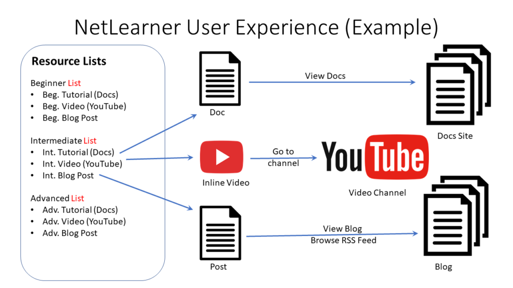
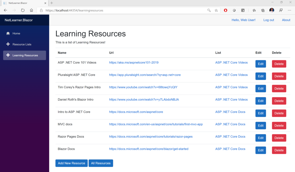
NetLearner Examples
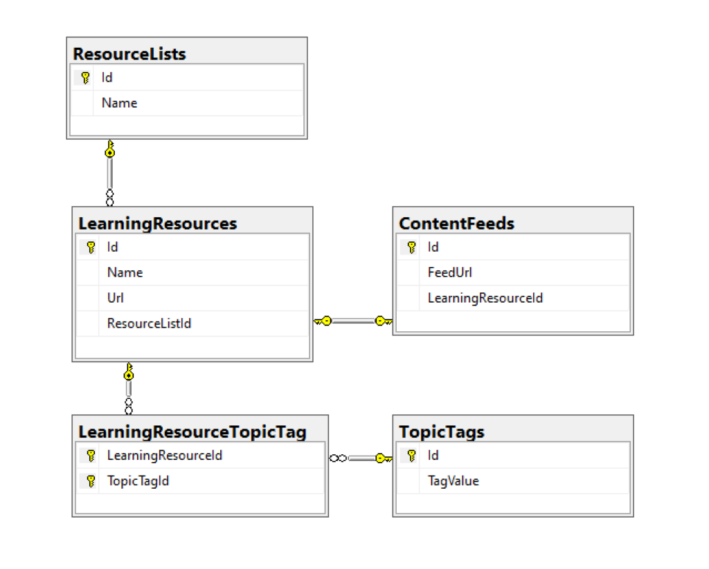
In the NetLearner repository, you’ll find multiple web projects with various views/pages and controllers where applicable. All models are shared in the SharedLib project.
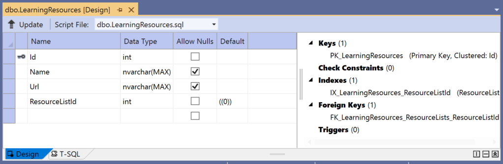
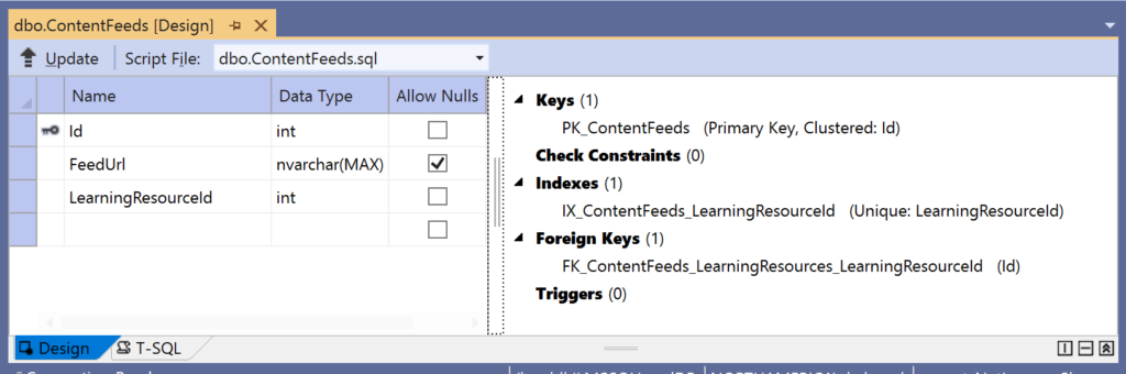
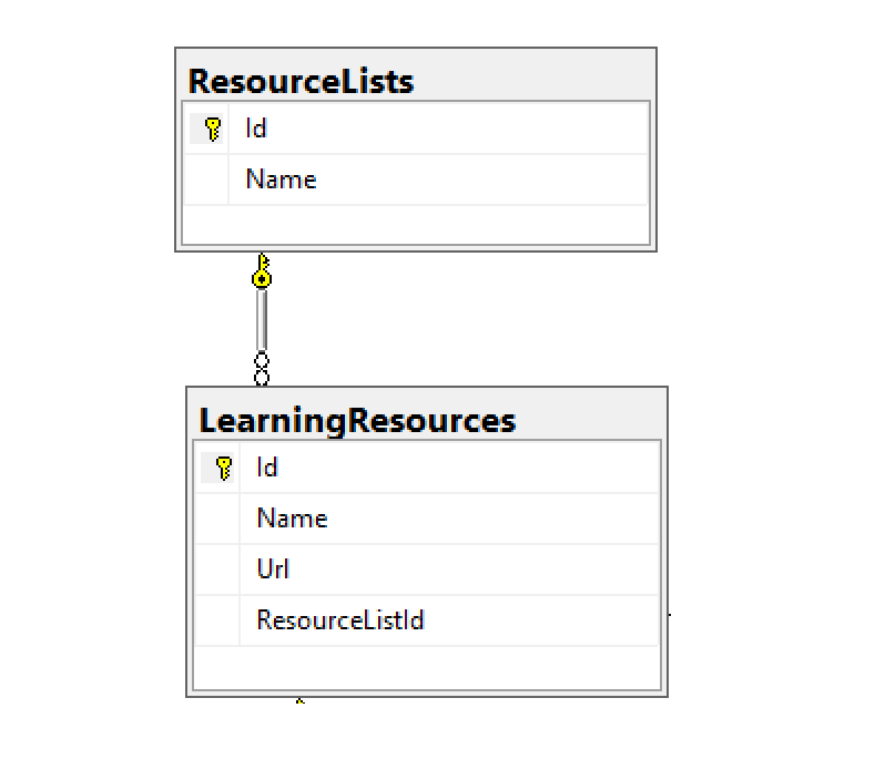
- Models: In the “Models” folder of the shared library, you’ll find a LearningResource.cs class (shown below) with some fields we will use to display HTML form elements.
- Views: Within the “Views” subfolder of the MVC project, the “LearningResources” subfolder contains auto-generated views for the LearningResourcesController’s methods.
- Controllers: The LearningResourcesController class was auto-generated for the Human model, and then its functionality was extracted into a corresponding service class.
- Services: The LearningResourceService class was written manually to provide CRUD functionality for the LearningResourcesController, and equivalent Razor/Blazor code.
- Razor Pages: Within the “LearningResources” subfolder of the Razor Pages project’s Pages folder, the pairs of .cshtml and .cs files make up all the CRUD functionality for LearningResources entities.
- Blazor Components: Within the “Pages” subfolder of the Blazor project, the LearningResources.razor component contains both its own HTML elements and event handlers for CRUD functionality. The ResourceDetail.razor component is reused by its parent component.
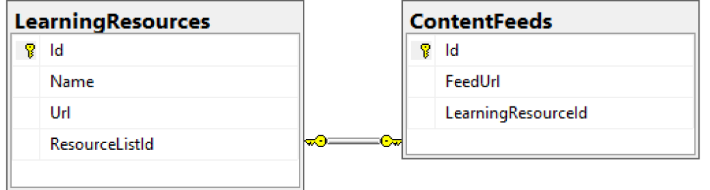
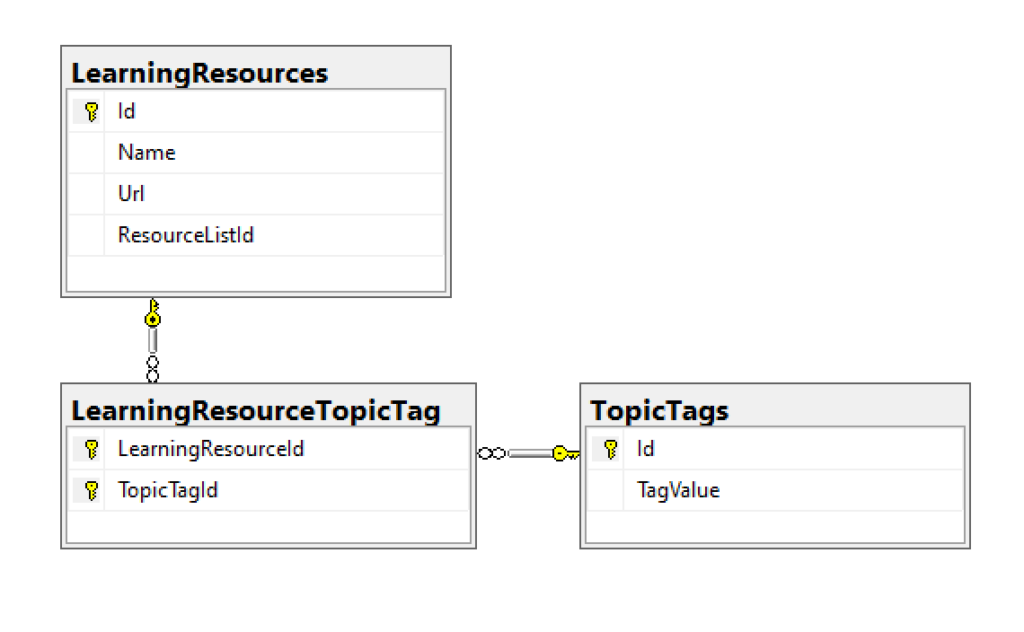
public class LearningResource
{
    public int Id { get; set; }

    [DisplayName("Resource")]
    public string Name { get; set; }


    [DisplayName("URL")]
    [DataType(DataType.Url)]
    public string Url { get; set; }

    public int ResourceListId { get; set; }
    [DisplayName("In List")]
    public ResourceList ResourceList { get; set; }

    [DisplayName("Feed Url")]
    public string ContentFeedUrl { get; set; }

    public List<LearningResourceTopicTag> LearningResourceTopicTags { get; set; }
}
Take a look at the Create and Edit views for the Human class, and you’ll recognize familiar sets of <label> and <input> fields that we discussed earlier.
...
<div class="form-group">
    <label asp-for="Name" class="control-label"></label>
    <input asp-for="Name" class="form-control" />
    <span asp-validation-for="Name" class="text-danger"></span>
</div>
...
[HttpPost]
public async Task<IActionResult> Create(
Bind("Id,Name,Url,ResourceListId,ContentFeedUrl")] LearningResource learningResource)

...
[HttpPost]
public async Task<IActionResult> Edit(
int id,
[Bind("Id,Name,Url,ResourceListId,ContentFeedUrl")] LearningResource learningResource)
The Razor Pages in their respective project handle the same functionality in their own way.
Razor Pages with BindProperty
Compared to MVC views, the newer Razor Pages make it a lot easier to bind your model properties to your HTML forms. The [BindProperty] attribute can be applied to MVC Controllers as well, but is much more effective within Razor Pages.
In the NetLearner repo, you’ll find a Razor web project with multiple subfolders, including Pages and their “code-behind” Page Model files.
- Pages: Within the “Pages” subfolder, the “LearningResources” subfolder within it contains Razor Pages along with corresponding .cs classes that contain the necessary Get/Post methods.
- Page Models: In the same LearningResources subfolder, the corresponding Page Models contain the necessary CRUD functionality. The implementation of the CRUD functionality from has been extracted into the Shared Library’s corresponding LearningResourceService service class.
This time, take a look at the Create and Edit pages for the LearningResources set of pages, and you’ll once again recognize familiar sets of <label> and <input> fields that we discussed earlier.
<div class="form-group">
    <label asp-for="LearningResource.Name" class="control-label"></label>
    <input asp-for="LearningResource.Name" class="form-control" />
    <span asp-validation-for="LearningResource.Name" class="text-danger"></span>
</div>
Since there are no controller classes in the Razor web project, let’s take a look at the corresponding C# classes for the Create and Edit pages, i.e. Create.cshtml.cs and Edit.cshtml.cs. In both of these classes, we’ll find the [BindProperty] attribute in use, right after the constructor and before the Get/Post methods.
 [BindProperty]
 public LearningResource LearningResource { get; set; }
This [BindProperty] attribute allows you to declaratively bind the LearningResource class and its properties for use by the HTML form in the corresponding Razor Page. This is an opt-in feature that allows to choose which properties to bind. If you wish, you could alternatively bind all public properties in the class by using the [BindProperties] attribute above the class, instead of above each individual member.
NOTE: By default, a Razor Page’s default methods for HTTP GET and HTTP POST are OnGet() and OnPost() respectively. If you wish to use custom page handlers in your HTML forms, you must create custom methods with the prefix OnPost followed by the name of the handler (and optionally followed by the word Async for async methods)
<!-- buttons with custom page handlers -->
<input type="submit" asp-page-handler="Custom1" value="Submit 1" />
<input type="submit" asp-page-handler="Custom2" value="Submit 2" />
// action methods in .cs file associated with a Razor Page
public async Task<IActionResult> OnPostCustom1Async() { }
public async Task<IActionResult> OnPostCustom2sync() { }
The standard set of Get/Post methods are shown below, from Create.cshtml.cs:
public IActionResult OnGet()
{
   return Page();
}
public async Task<IActionResult> OnPostAsync()
{
    if (!ModelState.IsValid)
    {
        return Page();
    }

    await _learningResourceService.Add(LearningResource);

    var resourceList = await _resourceListService.Get();
    ViewData["ResourceListId"] = new SelectList(resourceList, "Id", "Name", LearningResource.ResourceListId);
    return RedirectToPage("./Index");
}
Note that the LearningResource entity is passed to the service class (which passes it to the shared DB Context) to add it to the database. If you were to remove the aforementioned [BindProperty] attribute, LearningResource would be null and the save operation would fail. The above approach only opts in to accepting HTTP POST requests. To enable use of BindProperty for HTTP GET requests as well, simply set the optional parameter SupportsGet to true, as shown below.
[BindProperty(SupportsGet = true)]
Blazor Example
The Blazor version of NetLearner also reuses the same shared library for its CRUD functionality and entity models via the shared service classes. However, its front-end web app looks noticeably different. There are no controllers or views. Rather, the .razor files contain HTML elements and the C# code necessary to handle user interaction.
An overall example of the Blazor web project is explained earlier in this series:
- Blazor Full-Stack Web Dev: https://wakeupandcode.com/blazor-full-stack-web-dev-in-asp-net-core-3-1/
After the A-Z series is complete, stay tuned for new content that will explain Blazor’s use of <EditForm> and the use of Input Components to render HTML elements and handle events. For now, check out the official documentation at:
- Components in Blazor: https://docs.microsoft.com/en-us/aspnet/core/blazor/components
- Blazor forms and validation: https://docs.microsoft.com/en-us/aspnet/core/blazor/forms-validation
Input Components in Blazor include the following:
- InputText: renders an <input> element
- InputTextArea: renders an <textarea> element
- InputSelect: renders a <select> element
- InputNumber: renders an <input> element of type=number
- InputCheckbox: renders an <input> element of type=checkbox
- InputDate: renders an <input> element of type=date
References
- Tag Helpers in forms: https://docs.microsoft.com/en-us/aspnet/core/mvc/views/working-with-forms
- Anchor Tag Helper: https://docs.microsoft.com/en-us/aspnet/core/mvc/views/tag-helpers/built-in/anchor-tag-helper
- Model Binding in MVC: https://exceptionnotfound.net/asp-net-core-demystified-model-binding-in-mvc/
- Model Binding in ASP.NET Core: https://docs.microsoft.com/en-us/aspnet/core/mvc/models/model-binding
- BindProperty for Controllers or Razor Pages: http://www.binaryintellect.net/articles/85fb9a1d-6b0d-4d1f-932c-555bd27ba401.aspx
- Model Binding in Razor Pages: https://www.learnrazorpages.com/razor-pages/model-binding
- Introduction to Razor Pages: https://docs.microsoft.com/en-us/aspnet/core/razor-pages
- The ASP.NET Core Form Tag Helpers Cheat Sheet: https://jonhilton.net/aspnet-core-forms-cheat-sheet/